Ever been mesmerized by UI colour palettes on a website or application? Today we will cover UI colour palettes and go through the most important elements of a UI colour palette. Colour plays a very vital role in how we experience digital products. The moment we open a website or app, colour begins to influence how we feel. It can help build trust and retain information and brand name better.
Check out any website like Swiggy, Amazon, Blinkitt, or Myntra. What do the colours convey? Bright, messy, boring or energetic. A lot of times the difference is because of the colour combinations or the colour schemes used.
In UI design, colour is not just about decoration. It helps people understand what they are looking at. It shows them where to click. It highlights important actions. It also builds a strong brand recall value.
A well-designed colour palette makes an interface feel smooth and easy to use. A wrong one can simply make an even good product feel confusing.
This article will provide clarity on all the factors. I will explain everything you need to know about UI colour palettes here. You will learn what they are, why they matter, the types designers use. You will also get to learn about the best practices that help create effective colour systems.
Whether you are a beginner or an experienced designer, understanding colour will help you create better digital experiences.
A UI colour palette is a carefully selected set of colours used throughout a digital product. This could include a website, mobile app, dashboard, or software interface.
Consistency is the most important factor here. When users see the same colours used repeatedly for similar actions, they connect that website, and application to that brand. For example, when the buttons are always blue, users quickly adapt to the blue colour as clickable element.
A good colour palette also helps maintain visual harmony. All colours work together instead of competing with each other or standing out. Most UI colour palettes include several different types of colours.
If you’re looking to build a solid career in UI/UX design, then IIM SKILLS is here to provide you Best UI/UX Course in India with Gen AI.
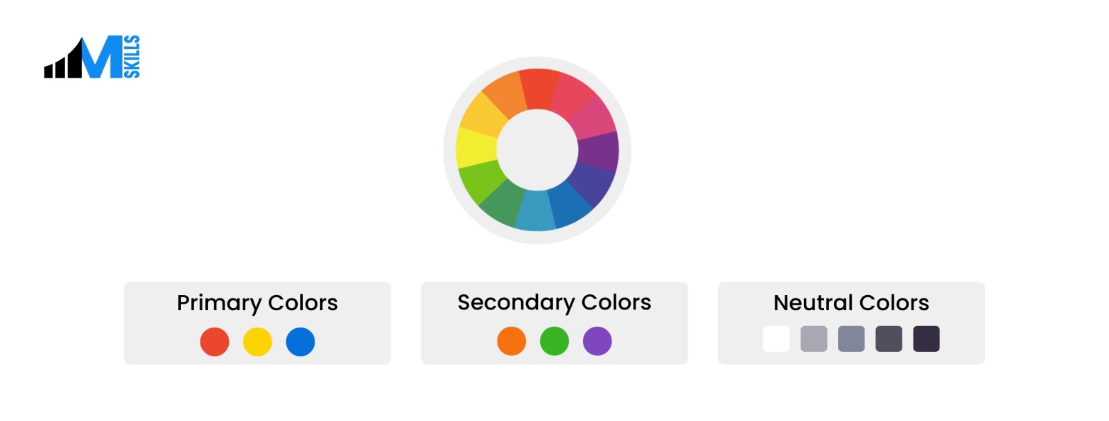
Types of Colours in UI Color Palettes
Primary Colours
These colours appear most often in the interface. They are used for navigation bars, buttons, or key interface elements. Many companies choose one strong primary colour that becomes closely linked with their brand. For example, many technology companies use blue because it feels professional.
Secondary Colours
Secondary colours bolster the work of the primary colour. They add variation and flexibility to the design. These colours might appear in cards, sections, or highlights. They help prevent the interface from looking repetitive while still maintaining consistency.
Neutral Colours
Neutral colours include shades of white, grey, and black. These colours are extremely important for the interface. They create structure and readability. Backgrounds, text, and spacing usually rely on neutral colours. Without neutral tones, the interface can quickly feel overwhelming.
Semantic Colours
Semantic colours communicate meaning. They help the system show feedback to the user.
Common examples include:
- Red for mistakes
- Green for success messages . When you download something, if it is successfully downloaded you might get a green coloured message.
- Yellow to warn or look before making a decision
- Blue for informational alerts
Accent Colours
Accent colours are bold colours used rarely. Designers often use them to highlight important elements such as call-to-action buttons or notifications. Because they are used less often, they naturally attract attention.
Know the difference between ui and ux to choose the best career for yourself.
Why UI Colour Palettes Matter
Colour choices have a direct impact on user experience. They influence how people navigate a product and how they feel while using it. There are several important reasons why colour palettes matter in UI design.
They Improve Usability
Colour helps users understand what actions they can take. For example, buttons may use a specific colour while inactive elements remain grey. This visual difference helps users quickly identify what is clickable. Without clear colour cues, users will invariably struggle to navigate the application.
Brand Identity Building
Colour is one of the most recognizable parts of a brand. Think about well-known digital platforms. Many of them are associated with a single colour. Consistent colour usage strengthens brand recognition and trust.
They Guide Attention
Colour can direct the user’s focus. Bright or contrasting colours are naturally impressive. Designers often use it to highlight important buttons, alerts, or messages.
Emotion Influencing
Designers use colour psychology to shape how users feel while interacting with a product. They can evoke a variety of reactions. Happy, sad, excited, alerted, you name it, colours can stir those emotions within you.
Want to know more about UI/UX - Check out these articles below:
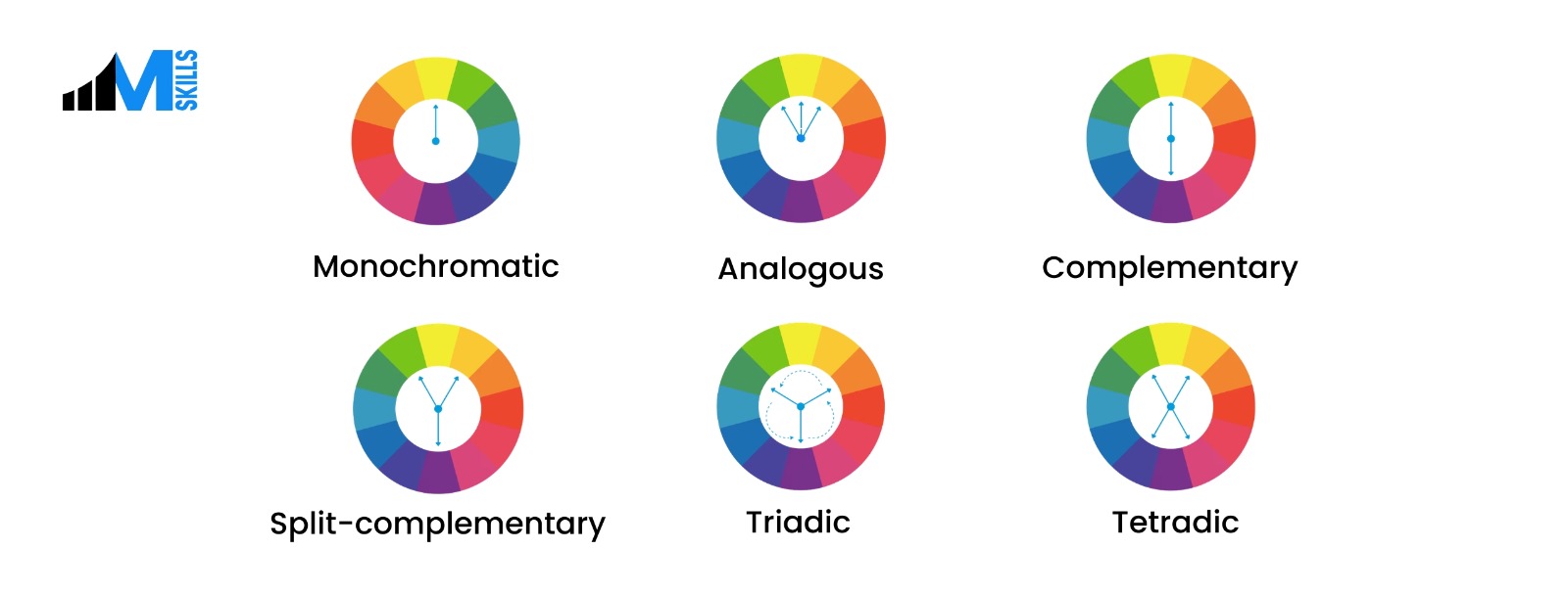
Different Types of UI Colour Palettes
We are going to delineate the features of each of the palettes here.
Monochromatic Palettes
- A monochromatic palette uses one base colour and a lot of varieties
- This type of palette feels clean and elegant.
Analogous Palettes
- Analogous palettes use colours like blue, and green.
- These palettes naturally feel balanced.
Complementary Palettes
- Complementary palettes combine colours from opposite sides of the colour wheel.
- Examples include blue and orange or red and green.
Triadic Palettes
- Triadic palettes use 3 colours spaced evenly
- This creates bright and energetic designs.
- Educational tools and creative platforms often use this type of palette.
Split Complementary Palettes
- They are a variation of complementary palettes.
- Here Ui designers choose two colours that sit next to the complementary colour.
- This creates contrast while providing more flexibility.
Tetradic Color Palettes
- Tetradic palettes use four colors arranged as two complementary pairs on the color wheel.
- They create vibrant, high-contrast UI designs while maintaining visual balance.
Neutral Palettes
- Designers may use white and grey for most of the interface.
- This approach creates a clean and professional look.
- Productivity tools and business software often use neutral palettes.
The Psychology of Colour in UI Design
Colour influences emotions and perceptions. Understanding colour psychology helps designers choose colours that match the mission of the product.
Blue
Blue represents tranquility, trust factor and reliability. Technological organizations and fin-tech use blue in their interfaces.
Green
Green is associated with growth, health, and success. It is often used in finance apps, wellness platforms, and environmental products.
Red
Red communicates urgency, energy, and warning. It attracts attention quickly, hence designers use it for alerts. Do not use red too much though as it adds to the stress element.
Yellow and Orange
Yellow and orange feel warm and energetic. They often create a sense of comfort, and affability. Brands that want to appear approachable often use these colours.
Black and White
Black and white create strong contrast and a modern appearance. They are minimalistic and give a chic appearance. Luxury brands use black and white to create a sophisticated look.
Other Professional Courses from IIM SKILLS
What Are the Best Practices for Designing UI Colour Palettes?
Below are some practical best practices designers follow.
Follow the 60-30-10 Rule
This design principle suggests dividing colours into three proportions. 60% of the interface should use a dominant primary colour. 30% should use a secondary colour. 10% percent should use an accent colour. This balance creates visual balance.
Stop using too many colours
Too many colours make interfaces confusing. Most designers keep their core palette between 5-7 colours. This keeps the design consistent and easy to understand.
Test the colours always
Colours often look different in real environments than they do in design software. Screen brightness, device type, and lighting conditions can all change how colours appear. Therefore,testing in real conditions helps ensure the palette works as expected.
Consider Dark Mode
Designers should plan colour palettes that work in both light and dark environments. It is easier on the eye and helps with better navigation
Stay consistent
Consistency is one of the most important aspects of UI design. All elements like links and buttons should use the same colours throughout the interface. This helps users quickly learn how the system works.
If you’re looking to upgrade your skills in 2026, then here are some IIM SKILLS Master Courses you should go for:
Frequently Asked Questions
1. How many colours should a palette have?
Most UI colour palettes contain five to seven core colours. These include primary, secondary, and neutral colours. The exact number may vary, but keeping the palette small helps maintain clarity.
2. Should designers simply use black and white?
Pure black and white can sometimes feel boring and jarring. Many designers prefer near-black text and slightly off-white backgrounds. Pure black backgrounds can work well in dark mode designs.
3. How do designers decide on colour palettes fron the beginning?
Designers usually begin with the brand personality. They ask questions like what emotions should the product invoke in the users, who is the target audience, what will be good for them etc.
Also Check:
UI/UX Design Courses in Pune
UI/UX Design Courses in Bangalore
UX/UI Design Courses in Chennai
UX/UI Design Courses in Delhi
UX/UI Design Courses in Mumbai
Conclusion
Colour plays a very vital role in UI design. Designers who understand colour theory, accessibility, and consistency can create interfaces that feel the best to the users.
Great UI colour palettes do not overwhelm the user. Instead, they help with users visiting the websites again and again.
When colours are chosen carefully and used consistently, the entire digital experience becomes smoother, clearer, and more enjoyable. Let us know which color palette you think would suit your application the most.
If you’re someone who’s looking to upskill, then IIM SKILLS is the right platform to learn Best Online Courses with Gen AI.